
The Big Red Toolbox
MGCEListView
An enhanced ListView Control
November 4, 1999
© NSB Corporation. All rights reserved.
|
|
The Big Red Toolbox MGCEListView An enhanced ListView Control November 4, 1999 © NSB Corporation. All rights reserved. |
MGCEListView provides a ListView control to programs which use controls of this type, such as NS Basic. Note that this object is NOT plug-in compatible with the Microsoft ListView object for Windows CE. Like the Listview control itself, MGCEListView is a somewhat complex object which requires some understanding of the basic listview control.
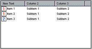
A Listview control is somewhere between a listbox and a grid. It is a two-dimensional control, like a grid, but doesn't allow the user to change anything anywhere at any time like a grid. In addition, a listview allows varying views, such as large icons, small icons and listings, as is demonstrated by simply changing the view of files in Explorer which uses a listview control. In effect, there is only one column in a listview control. Therefore, rather than referring to items in a listview by row and column, as you would with a grid, items are referred to as "items" and "subitems". An "item" is data appearing in the leftmost column of a listview when placed in report (or "detailed") mode and is the column which contains data a user may directly edit. Columns within the same row are referred to as "subitems" and contain data the user cannot directly change. Going back to Explorer, the "item" column is that which displays the file name. Other columns, such as "Size", "Type" and "Attributes", are all "subitems". "Attributes", for example, would be subitem four in Explorer (The desktop version of Explorer!). The explanation above is for the purpose of understanding the following object documentation.
In addition to text data, a Listview control can make use of images. This is done through with "image lists" which are nothing more than just that: Lists of images. MGCEListView maintains two image lists, one for small images (16x16 pixels) and a second for large images (32x32 pixels). You may use one, both or neither of these image lists as your project demands. An image list simply maintains the images for you in memory in a numbered list. When adding bitmap files to an image list, the first image added is image one and the count increases by one for every image you add to the list. If you add ten images to an image list and you want to use the last image you added, you want to use image ten and so on.
It's important to understand that the MGCEListView is based on the Windows Listview common control. For a more indepth look at what a listview control is and how it works, refer to Microsoft documentation on the control. MGCEListView enhances the control slightly for the purpose of its use as an object under Windows CE, but it's still a Windows ListView common control underneath it all.
Connect your Windows CE device to your desktop using ActiveSync. On the desktop, run the program MGCEListview.exe. Follow the instructions on the screen to complete the installation.
AddObject "MGCEListView.ListView", "LView", 10, 10, 400, 160
| AddContextItem | Adds an item to the context menu. If the item begins with a dash(-), a separator is added to the menu.
|
| AddLgImage | AddLgImage adds an image to the "large image list". The image must be a standard Windows bitmap file. 16 colors is recommended.
|
| AddSmImage | AddSmImage adds an image to the "small image list". The image must be a standard Windows bitmap file. 16 colors is recommended.
|
| Arrange | Arrange items in Icon View using. Use 0 for default alignment, one to align along the left edge of the control, two to align along the top of the control and five to align along a default grid.
|
| Clear | Clear removes all data from the control.
|
| ClearContext | Removes all items from the context menu.
|
| DeleteColumn | DeleteColumn removes a column, the leftmost being column one, from the control. Columns are displayed when the control is in "Report View". The column parameter is optional.
|
| DeleteItem | DeleteItem removes a row of data from the control, the topmost row being row one. All columns in the row are removed. The row parameter is optional. LView.DeleteItem iRow |
| EnsureVisible | Use this method to be certain that an item is visible.
|
| SetFocus | Gives the control input focus.
|
| InsertColumn | InsertColumn adds a new column in the specified position, starting with one. The column text, width and image are also specified with InsertColumn. Note: The first image in an image list is number one. If you do not want an image in the column header, use zero as the image number. The column number, width and image parameters are optional and default to zero.
|
| InsertItem | InsertItem adds a data item to the control at the specified position, the first position being one. The item's text, image and a user defined value are also specified with InsertItem. If you do not want an image displayed with the text, use zero as the imagenum parameter. The Row, Image and Value parameters are optional and default to zero. This method returns the postion the item was inserted: useful when using a sorted listview.
|
| RemoveContextItem | Removes an item from the context menu based on it's index, starting with one.
|
| RemoveLgImage | Remove an image from the Large Image List.
|
| RemoveSmImage | Remove an image from the Small Image List.
|
| SetItem | SetItem does double duty in that it modifies data anywhere in the listview as well as adding subitems to an existing row of data. The row and column parameters, both starting at one, specify the position in the control. "text" is data to display in the listview and the imagenum refers to the number of an image within an image list to display with the text. Use zero if you do not want an image. The Row, Column, Image and Value parameters are optional and default to zero.
|
| SetColumn | SetColumn modifies an existing column header which is displayed when the listview is in "Report View" mode.
|
| AllowEvent | Certain events may be allowed or cancelled depending on this property's setting from within the event handler. For these events, set AllowEvent to TRUE to allow the event to continue or FALSE to cancel the event and discard any changes that come from the event. This is a write-only property and the default value is based on the value of the AllowEventAsDefault property.
|
| AllowEventAsDefault | This property is used as the default value of events which are not specifically handled or do not set the AllowEvent property. The default is TRUE which allows all events to continue by default.
|
| BackColor | BackColor sets the background color for parts of the listview control containing data.
|
| Border | Enables and disables the border. Use zero for no border, any other number to display a border.
|
| Checkboxes | Enables and disables checkboxes in the first column of the control. Use zero to disable checkboxes, any other number to display checkboxes.
|
| Checked | Read-only. A value of zero indicates that a row's checkbox is unchecked. Any other value indicates that the checkbox is checked. This property cannot be set, only read and is undetermined if checkboxes are not enabled at the time.
|
| ColumnCount | The read-only ColumnCount property returns the number of columns
currently displayed within a listview control.
|
| ColumnOrder | An array of integer values is used to set and retrieve the display order of columns displayed when in "Report Mode". See the program code below for an example of setting and retriving the column order.
|
| ColumnImage | Set and retrieve the image number current in use by an item or subitem.
|
| ColumnText | Set and retrieve the displayed text of an item or subitem.
|
| ColumnWidth | Set and retrieve the pixel width of any individual column.
|
| Count | The number of items (subitems are not included) may be retrieved by reading this property. Setting the property forces the listview control to allocate memory to contain that number of items rather than its allocating memory for every item added as it is added to the control.
|
| EditItems | When set to zero, the user may not directly edit data in the first column of the control. Set to any other number, the user may edit the data by clicking on a selected item.
|
| FontBold | TRUE (non-zero) selects a bold font, FALSE (zero) selects a normal font
|
| FontName | Specifies the name of a font to apply to the listview control.
|
| FontSize | Specify the size of a font to apply to the listview control.
|
| FindText iStart, "text" | Read-only, FindText locates an item containing the specified text, returning the row in which it was found. Set iStart to one to begin at the first row. The search is not exact. If you specify "Fin" and one item contains "Find this" and another, greater in number contains "Fin", it will find "Find this" first.
|
| FullRowSelect | Set to a non-zero number to select an entire row of data if any column in that row is selected. Set to zero, only the leftmost column is selected regardless of what is selected in that row by the user.
|
| GridLines | Set to a non-zero number to display grid lines between each row and column in the control. Set to zero to eliminate these lines.
|
| ImageLists | MGCEListView maintains two images lists, one for small images and another for large images. In order to use the image lists, you need to add images, then apply the image lists to the listview, which is the purpose of the ImageLists property. Set this property to zero if you do not use the image lists at all. Otherwise, one will apply the small image list to the control, two will apply the large image list to the control and four will apply small images to the column header. You may use any combination of these. For example, to use only small images in the listview and its header, you would use 1 + 4 or five.
|
| ItemImage | Set and retrieve the image number currently in use by an item or subitem. LView.ItemImage( 1, 1 ) = 2 |
| ItemText | Set and retrieve the text displayed by an item or subitem.
|
| ItemValue | Set and retrieve a 32 bit value associated with an item or subitem. This value is user defined and has no meaning to the control itself.
|
| LgImageCount | Read-only, this retrieves the number of images in the large image list.
|
| RowsPerPage | A read-only property which returns the number of rows of data that will completely fit vertically within the control without scrolling when the control is in list or report views. When in another view, the value returned is the number of items currently contained by the control.
|
| Select | Set and retrieve the selected state of a row. Non-zero indicates that an item is selected or to be selected. Zero indicates that an item is not selected or to be deselected.
|
| SelectedCount | Read-only value which returns the number of selected items in the listview control.
|
| Selection | Set Selection to a number if you only want a single item selected at any given time. A zero setting allows multiple items to be selected.
|
| SelectionDisplay | When set to zero, the display of a selected item is lost when the listview control loses focus. The selection itself is not lost and is again displayed when the control regains focus. Set to a non-zero number, the control displays selected items as selected regardless of focus.
|
| SmImageCount | Read-only, this returns the number of items in the small image list.
|
| Sort | Set to zero if you don't care about sorting. Set to one, sorting is done is ascending order. Set to -1, sorting is done in descending order.
|
| Style | Set and retrieve the Style property which determines how the edge of the control is displayed. This is different from the Border property. Styles include:
LView.Style = 2 iStyle = LView.Style |
| SubItemImages | When set to zero, subitems (columns other than the leftmost) do not display images even if an image is specified for data displayed in those columns. Setting this property to a non-zero number enables image display in those columns.
|
| Tabstop | Set this property to TRUE (non-zero) to include the control in the tab order. FALSE removes it from the tab order and the default is TRUE.
|
| TextColor | Set and retrieve the color used when displaying text. clr = LView.TextColor |
| TopIndex | A read-only property which returns the index of the first visible item when the control is in list or report views.
iItem = LView.TopIndex/CODE> |
| View | Set and retrieve the current view. Use zero for "Large Icon view", one for "Report View", two for "Small Icon view" and three for "List View".
|
| Version | Gets the version number of the control as an integer. |
| ColumnClick | When the user clicks upon a column, this event is called and passes the column number that was clicked upon, staring with one for the leftmost column.
|
| ContextMenu | The ContextMenu event is called when an item is selected from the listview context menu. The listview item over which the menu was displayed (may be zero for no item) and the text of the selected menu item is passed to the event handler.
|
| EndEdit | When the EditItems property is set, the user may directly change data in the first column of the listview control. When that data is changed, this event occurs which passes the row and column that was changed. In addition, new data, if any, is also passed to the event handler. The text can be empty ("") if the user cancelled the change or entered nothing into the edit box. By default, changes are allowed to be reflected by the control itself but setting AllowEvent to FALSE from within the handler or setting AllowEventAsDefault to FALSE will prevent changes from showing in the control.
|
| EndHeaderDrag | Columns may be resized by the user dragging a border edge. When the user finishes dragging the edge and resizing the column, this event is fired, passing along the identifier of the resized column.
|
| HeaderDrag | This event is called as a column header is being resized by the user dragging a column edge. The event receives the column identifier.
|
| ItemActivate | Double-clicking an item in the listview control causes this event. The row and column that was double-clicked is passed to the event.
|
| ItemClick | Clicking upon an item in the listview control triggers this event which passes the row and column of the item that was clicked upon.
|
| Keypress | Pressing a key while the object has input focus triggers this event, passing the value of the key pressed along with it.
|
| PostClick | If checkboxes are enabled and a checkbox value is changed, the value is not actually updated until after the ItemClick event. The PostClick event is slightly delayed, allowing accurate polling of a checkbox.
|
| StartDragSelect | Multiple items in a listview control may be selected by moving the stylus to draw a "box" around the items. The start of this process triggers this event which may be cancelled by setting AllowEvent to FALSE from within the event handler.
|
| StartEdit | When the listview control enters "edit mode", this event is triggered and the item about to enter edit mode is passed to the event. The event may be cancelled by setting AllowEvent to FALSE from within the handler. Only items may use edit mode, not subitems.
|
10/5/99: Fixed Hide, Show
10/10/99: Added ColumnCount, FontBold, FontName, FontSize, RowsPerPage, TopIndex, EndHeaderDrag and HeaderDrag.
10/28/99: ItemImage and ItemValue now can be set, and PostClick event added.
11/4/99: InsertItem now returns the position where inserted