|
You may need an icon when you develop your application, but there may be other cases in which you have to prepare your own icons. For example, this Japanese site, "CLIE USer Club!'s ccc", uses an icon to represent a linked web site. So the site owner has to prepare an icon to get his/her site linked.
The purpose of this document is to help people create their own icons.
The issue that arises when you create an icon is not the tool you choose but the design of the icon. Here is an icon in my web site:

Here is another one in CliCliClie:

The texts in these icons are seen clearly, but it is not so easy to create a small icon with text in it. There are some techniques you need to use. Most painting and drawing tools are capable of writing text strings using desktop fonts. When the text is written large, it looks nice showing the font's characteristic.

However, if the text is very small, it is hard for people to recognize what font to be used. And the text may not be balanced well. The text above uses 28-point MS Gothic. The same font in 10 point looks like this:

Let's compare the two enlarged small icons:
The right icon looks better but the size is slightly larger. So I am comparing one more icon that is written using 9-point MS Gothic:

Reducing one point unshapes the character "m", and space between "Pa" and "lm" becomes noticeable.
To make characters look better, anti-aliasing is a good option to use. It can eliminate jaggy borders. The characters below are 100-point MS Gothic (Japanese). The right character is anti-aliased and looks much better than the left one.
For those small icons, however, antialiasing blurs them:

Therefore, the text tool in painting/drawing applications is not practical to create small icons with text.
How can we create nice looking text in a small icon?
Even though it is very old fashioned, making your own fonts is very effective.
You don't have to create all characters you know - just designing required characters is all you need.
Since all alphabet characters can be written nicely in the area of 5x7 pixels, Windows standard application "Paint" is good enough for this task.
Each of characters below can fit into 5x7 pixels. It looks good, doesn't it?

In the enlarged picture below, oops! it doesn't look good, does it?
However, the 60x60 pixel square surprisingly contains 52 characters! Still you can make them even smaller.The next pictures, for example, are 40x40 pixel squares.
 
Maybe on the desktop it is hard to recognize all characters. Let's enlarge them to check:
They are not perfect shapes. :-) But you don't need all 26 alphabet characters - just arrange required characters with readable size.
Let's look at the icon I showed at beginning:
It would probably be hard to use wide characters, such as "M" and "W", in this design. But with absence of those characters, CliCliClie is able to be a slim design.
Now you've got tools and techniques, the rest is your design taste.
NS Basic now accepts common graphic formats.
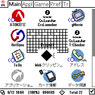
By the way, do you know how big the icon can be? To find out, I experimented with the picture below. It is 70x40 in size and contains grid lines in every 5 pixels.

I use this as an icon in my project. After the project is compiled, the result looks like this in the launcher:
Let's take a look at it in bigger size:
Probably the area of 60x24 pixels is drawn. Because of the title, 60x22 should be the biggest size.
This screen shot is taken from PalmOS4.0-based POSE (Japanese version), but I got the same result on my device CLIE N600C. This is just an experiment, so it is probably wise to make your icon less than 40 pixels in width. But just in case, keep in mind that you have the larger area to play with.
Mr. Takahashi's Crs-Launcher hi-res version displays the whole picture. If you want to go wild, try it!
That's all about icons. I hope someone will find this article useful.
You can freely use alphabet characters I provided in this document.
|