
|
|
Tutorial 09: Bitmaps, Gradient Buttons and PicturesJanuary 19, 2009© NSB Corporation. All rights reserved. |
There are 3 different ways to use a Bitmap object:
One thing to keep in mind is that is not possible to have images which are greater than 64K in a bitmap. See "Images Bigger than 64K" for techniques to work around this.
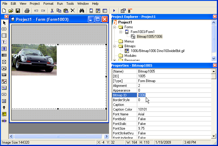
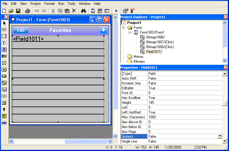
Let's get started. Open a new project, and add a Bitmap object to it:
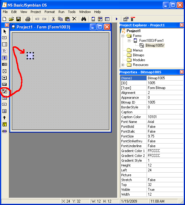
You will see there are quite a few properties that can be set in the Bitmap object. Don't worry about trying to understand them all right now. As we work through the Tutorial, you will see what each one can do. If you are in a hurry to find out about one in particular, use the Seach function on this page to find it.
Bitmaps give you the most control over the final appearance. You can specify different images for different sized screens, with different bit depths.
Pictures offer more flexibility. You can stretch or shrink the image to a precise size. Read more about them in the next section, "Using Pictures".
The first step is to add the image to the project.
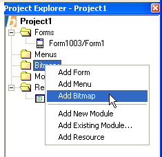
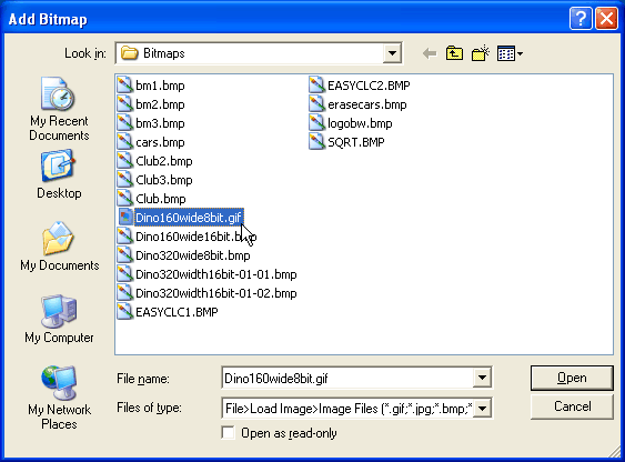
Select Dino160wide8bit.gif and click on Open. Images can be gif, jpg, bmp or ico.
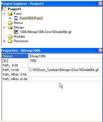
Now the bitmap is added to the project. Notice that it has several paths. Regular paths (the ones that do not say "Hi Res") are images designed for screens that are 160x160. HiRes images are designed for 320x320. If the actual screen size is something else, the pictures will be appropriately scaled at Runtime.
The Bit Depth (8 and 16 in this case) determines how many colors are displayed. Most devices can handle 16 bit color these days. However, a lower bit depth image will use less memory. A Bitmap may have multiple images, each optimized for devices of different screensize and bit depth: this is useful if the application requires that you be fussy about appearance.
Depending on whether you're running on a Symbian or Palm device, you may have a different set of path options.
The images for one bitmap consitute a family. The total size of all the images in a family must be less that 64K. See "Images Bigger than 64K" for techniques to work around this.
With this particular image, we know (from the name) that it is 160 pixels wide with a bit depth of 8. Let's set it up in the "Path, 8-bit" property.
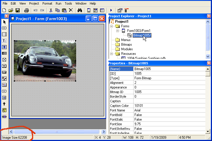
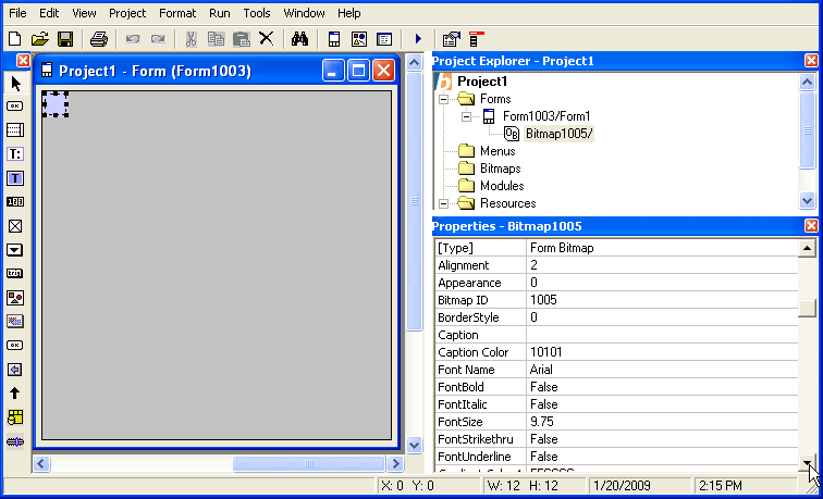
Next, we have to associate the bitmap image (Bitmap1006) with the Bitmap Object on the screen (Bitmap1005). To do this, we click on the bitmap on the Design Screen, and change its Bitmap property to 1006.
(You may need to close the Design Screen and reopen it, by clicking on the form name in the Project Explorer, to get the image to show.)
You now see the image, as well as the area it will take up on the form. The Design Screen normally displays double size, so it is easy to see. The image does not get scaled, so it does not fill the whole area in the Design Screen. On an actual device, it will. For the same reason, the "Image Size" shown at the bottom left of the IDE is not correct in this case. (Yes, Support at NS Basic says they are working on this.)
That's it for using Bitmaps.
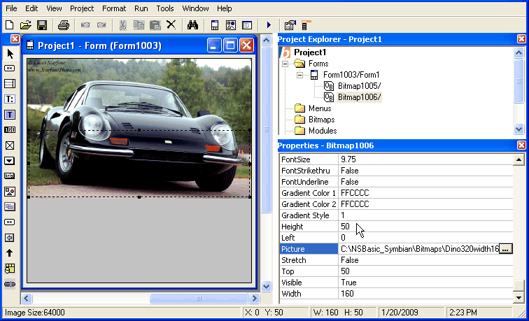
Let's start with a new project, and add a Bitmap object.
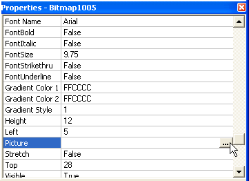
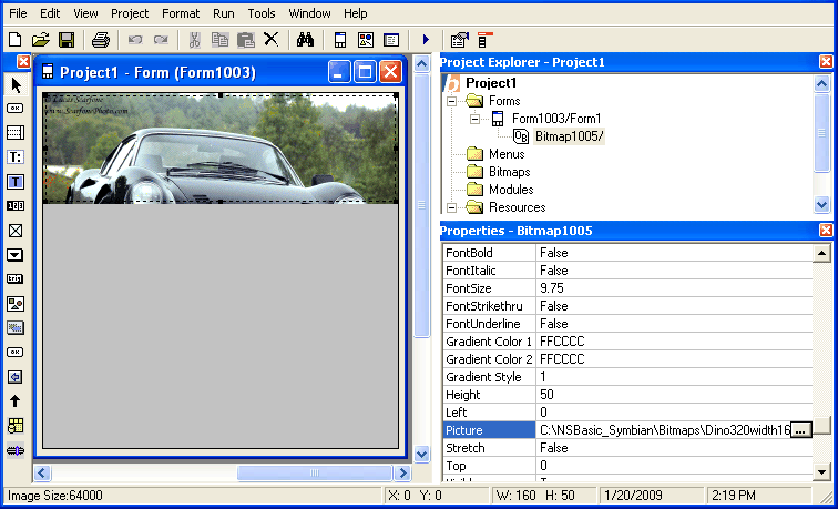
Next, let's set the Picture property to our image:
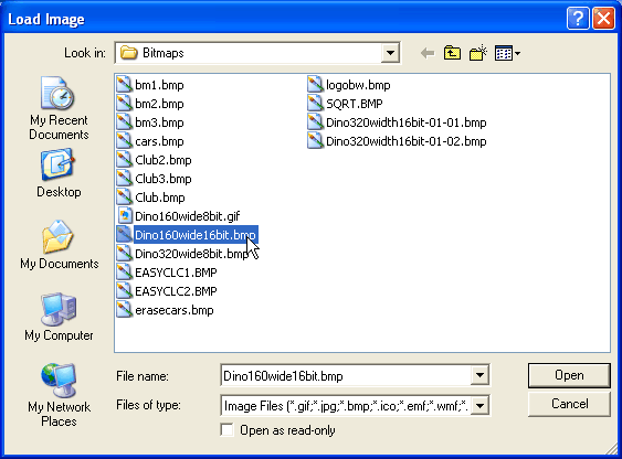
We choose the 16 bit version of the picture - it will give us more accurate colors.
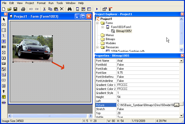
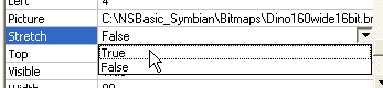
The picture is 160 pixels wide: it shows actual size. Let's make it bigger by dragging the bottom right corner. First, we have to set the Stretch property to True:
Now we do the drag...
You can see, on the bottom left of the IDE, the size in bytes of the image. Take care that it does not exceed 65,512 bytes: it will not compile. See "Images Bigger than 64K" for techniques to work around this.
Also, notice that the quality of the picture has gone down. There just isn't enough information in the original photo to have higher quality. The solution is simple: Start with a bigger picture. The size of the picture you start with doesn't matter. It is the final Image Size that counts.
When working with Pictures, there are a couple of other properties which can be useful. BorderStyle lets you specify a 1 pixel wide black border around the edge of the picture: the default is no border. Appearance, normally flat, allows you to create a 3D appearance to the picture. In both cases, setting Stretch to true allows the image size to be adjusted for the additional pixels that are needed for these options.
Let's play around with these features. Start a new project and add a bitmap object:
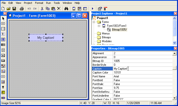
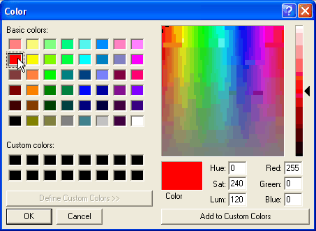
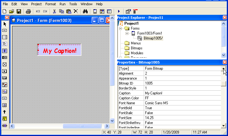
Let's make it a bit more interesting. Change the Font Name, Font Size and FontBold. You will see the changes right away on the Design Screen. Put a border on it (BorderStyle), and make it 3D (Appearance). The Alignment of the Caption can be Left, Right or Center. Change the Caption Color to change the color of the text:
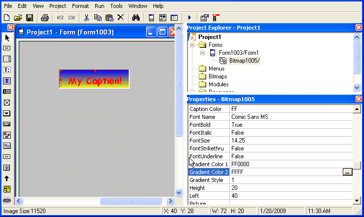
Setting a Gradient
Let's set Gradient Color 1 to Blue and Gradient Color 2 to yellow:
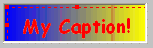
Wow, that's eye popping ugly!
There's one more useful feature: the Gradient Style. It can be 1 (top to bottom) or 2 (left to right). Changing it to 2 actually makes this image uglier!
While this bitmap certainly is not attractive, you can make very nice looking bitmaps if you use a bit of good taste and patience.
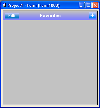
Here is a good example, done in the style of Apple's iPhone. An easy to read screen font (Ariel, which looks a lot like Helvetica) is used. The color transitions are gentle and subtle. This image is actually made up of 3 bitmaps: The "Edit" and "+" buttons are bitmaps on top of a full width bitmap with the Caption of "Favorites". On an actual device and in the IDE, the color transitions are more gradual than can be rendered in this document.
Cool stuff!
Next, let's put a message in the TextBox when the plus sign is clicked. (Do the same for the Edit Bitmap.)
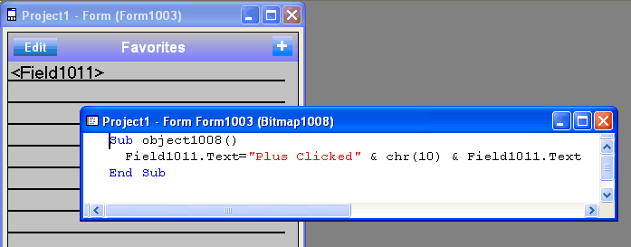
Here is how the app looks when it is running and the two buttons are clicked:

Images have a limit of 64K. The actual formula is
width * height * bitdepth + 23 < 65535What do you do if your image is larger?
The method used is called Tiling. You cut the image up into smaller pieces, then display them next to each other to make a larger image. Let's start another project, with a bitmap in the top left:
Set the picture property to Dino320width16bit-01-01.bmp
See the image size? 64,000 bytes, just about as big as is allowed. Now, set up another bitmap just underneath, with image Dino320width16bit-01-02.bmp
There we go! We have made what will look like a single picture out of the two images.