
The Big Red Toolbox
MGCETreeView
A enhanced TreeView Control
September 21, 1999
© NSB Corporation. All rights reserved.
|
|
The Big Red Toolbox MGCETreeView A enhanced TreeView Control September 21, 1999 © NSB Corporation. All rights reserved. |
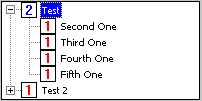
MGCETreeView provides a TreeView control to programs which use controls of this type, such as NS Basic. In addition to "standard" treeview functionality, this control also supports a "context menu", displayed when the control is tapped while pressing the Alt key.Note that this object is NOT plug-in compatible with Microsoft's TreeView ActiveX object for Windows CE.
A word about the mysterious "item":
The word "item" is used quite a bit when describing the following properties, methods and events provided by this control. In reality, an "item" is simply a 32 bit numeric value, but it is NOT something you can add or subtract to or from another item, nor is it something that will be of any use to anything but the treeview control since it's a treeview node identifier. When adding a new item to the tree, there is no reference already there, so use zero as the parent or insertion point of the first item. The item returned will be a valid item which may then be used to add more items after or within that initial item. As a reference, the Microsoft Treeview control maintains items in the treeview using the "node" object. MGCETreeView maintains the items in the same manner, but reduces the complexity by removing the "node" item.
AddObject "MGCETreeView.TreeView", "Tree", 10, 10, 400, 160
| AllowEdit | Set AllowEdit to TRUE (non-zero) to allow the user to edit items in the treeview directly by tapping a selected item. FALSE (zero) prevents the user from directly changing an item. The default value is FALSE.
|
| AllowEvent | The treeview control supports several events, many of which may be allowed or denied at the time they occur through this write-only property. When set to TRUE (non-zero), an event is allowed to occur. For example, a user may expand a tree or edit an item. When set to FALSE, the event is denied and the action does not occur. The default value for this property is set using the AllowEventAsDefault property.
|
| AllowEventAsDefault | This property value is used by the treeview control for events that you do not specifically handle. As an example, if you do not want the user to do anything unless you specifically allow them to do so, you would set this property to FALSE (zero). The default value is TRUE (non-zero) which allows all events unless specifically told otherwise via the AllowEvent property within an event handler.
|
| AutoExpand | When set to TRUE (non-zero), a tree item automatically expands when selected. In addition, any other expanded tree items are closed when the new item is opened. The default value is FALSE.
|
| Border | TRUE displays a border around the control, FALSE removes the border. The default value is TRUE.
|
| Child | The read-only Child property retrieves the first child of a tree item specified.
|
| Count | This read-only property retrieves the number of items in a tree.
|
| FirstItem | The FirstItem property retrieves the first item in the tree. This is a read-only property.
|
| FirstVisible | This retrieves the first visible item in the tree and, if possible, scrolls a specified item so it is the first visible item.
|
| FontBold | Set this property to TRUE to display text using a bold font, or FALSE to display text using a normal font. The default is FALSE.
|
| FontName | Set and retrieve the name of the font to use with the control. The default is "Arial".
|
| FontSize | Set and retrieve the height of the font to use with the control. The default is 12.
|
| HasButtons | "Buttons" are the "+" and "-" boxes to the left of a tree item that has child items. You may enable these by setting this property to TRUE or remove them by setting the property to FALSE. The default value is TRUE.
|
| HasLines | The connecting lines between items may be enabled and disabled using this property. TRUE enables the lines, FALSE removes the lines and the default value is TRUE.
|
| Indent | Indent specifies the number of pixels tree items are indented per level. The default value is 19. |
| ItemImage | You may specify what image is displayed by a tree item using the ItemImage property. Images must be enabled and loaded.
|
| ItemSelectedImage | Use this property to set and retrieve the image (if any) displayed when a tree item is selected.
|
| ItemText | Set and retrieve text associated with a tree item.
|
| ItemValue | Set and retrieve a user defined 32 bit value associated with a tree item. This value is not used by the control itself.
|
| NextSibling | This read-only property retrieves the next item in a tree that is on the same level as a specified item.
|
| NextVisible | Read-only property used to retrieve the next visible item in a tree given a specified item.
|
| Parent | Read-only property used to retrieve the parent item of a specified item.
|
| PreviousSibling | Read-only property used to retrieve a previous item on the same level as a specified item.
|
| PreviousVisible | Use this read-only property to retrieve the previous visible item of a specified item.
|
| RootLines | In addition to connecting lines between items, connecting lines between top level (root) items may be enabled and disabled using this property. FALSE removes the connecting lines and TRUE, the default, displays the connecting lines.
|
| Select | Retrieve or set an item selection state.
|
| SelectionDisplay | This property determines how a selected item is displayed when focus is moved away from the treeview control. Set to TRUE (non-zero) to retain selection display when focus is lost or FALSE to lose the selection display. The default value is TRUE.
|
| Style | Set and retrieve what style is used when drawing an edge around the control. This is separate from the border which is enabled and disabled using the Border property. Style values are:
|
| Tabstop | When set to TRUE (non-zero), the control is included in a window's tab order. Set to FALSE (zero), the control may not be reached via Tab. The default value is TRUE.
|
| TreePath | This read-only property retrieves the full "path" from a specified item back to the top level item.
|
| UseImages | Set this property to TRUE if you want the treeview control to display images. FALSE removes the images. The default value is TRUE.
|
| UseSelectedImages | When set to TRUE, the treeview displays images with selected items. Set to FALSE to disable image display along selected items. The default value is TRUE.
|
| Version | Returns the current version number of the control as an integer. |
| AddContextItem | Add an item to the treeview context menu. The menu will not appear unless there is at least one item. If the string begins with a dash (-), the menu item added is a separator.
|
| AddImage | The treeview control uses images stored in an "image list" which is automatically created along with the control. You may add images to this image list using this method. The first image added to the list is referred to as one (1) and each image afterwards is referred to as 2, 3, 4 and so on. Images should be 16 colors and 16x16 in size.
|
| AddItem | Use the AddItem method to add items to a treeview control. The first optional parameter, Parent, may be omitted if there is no parent (a top level item) and the second optional parameter, InsertAfter, may be zero if nothing is to come before the new item on it's given level within the tree. The return value is the number of the item added. Parameter three is text to display in the item followed by a 32 bit user defined value. The last two parameters determine the image numbers to use with the control and are also optional. The return value may be used to add new items that appear after the new item or within it as an expandable tree.
|
| Clear | Remove all items from a treeview by calling this method.
|
| ClearContext | Remove all items from the treeview context menu.
|
| CollapseItem | You may collapse an expanded tree item by calling this method.
|
| DeleteItem | Delete an item from the tree control.
|
| EndEdit | When the treeview is in "edit mode" by either a user tapping a selected item or programmatically, the edit mode may be ended by calling this method. A parameter determines if the changes made at that point are denied or allowed. TRUE discards any changes and FALSE allows changes to be made to the control.
|
| ExpandItem | A tree item may be expanded to show items within it by calling this method.
|
| Hide | Hide the treeview control.
|
| MakeVisible | MakeVisible ensures that a specified item is visible by expanding any trees and scrolling the item into view.
|
| RemoveContextItem | This removes an item from the treeview context menu and the item identifier passed is the position, starting with one, of the item to remove.
|
| RemoveImage | RemoveImage removes an image from the control's image list.
|
| SetFocus | This method gives the control input focus.
|
| Show | Display the tree control.
|
| StartEdit | StartItem programmatically begins the treeview "edit mode" using a specified item. The return value is the window handle of the edit control.
|
| ToggleItem | If a specified item is collapsed, it is expanded. If it is expanded, then it is collapsed.
|
| Changed | When selection is changed from one treeview item to another, this event is fired and passes the item losing selection and the item getting selection. If the AllowEvent property is set to FALSE within the event's handler, the change is denied.
|
| Changing | This event is fired when selection is changing but before it has actually changed. Set the AllowEvent property in this event's handler to prevent the selection change from happening.
|
| Collapsed | When an expanded tree item is collapsed, this event is called and passes the item that was collapsed. Set the AllowEvent property in the event handler to prevent the item from collapsing.
|
| Collapsing | This is the same as the Collapsed event except that Collapsing occurs before the item is actually collapsed.
|
| ContextMenu | This event is fired when a context menu selection is made. If the menu is closed without selecting an item, the event does not occur. The first parameter passed is the treeview item identifier where the control was tapped or zero if it was not tapped over an item. The second parameter is the text of the selected menu item.
|
| EndEdit | When AllowEdit is enabled, a user may edit a tree item by tapping a selected item. When the user presses Enter, this event is fired, passing the item and new text entered by the user. If AllowEvent is set to FALSE from within the event handler, the change is not allowed and the item reverts back to its original text. If the user cancels the edit, the event is not fired.
|
| Expanded | This event is fired after a tree item has been expanded. You may prevent the item from staying expanded by setting AllowEvent to FALSE from within this event's handler.
|
| Expanding | Same as the Expanded event except that this event is fired before the item is actually expanded.
|
| Keypress | When a key is pressed while the control has input focus, this event is fired and passes the key value. AllowEvent has no effect on this event.
|
| StartEdit | When the user initiates the changing of an item by tapping a selected item, this event is fired, passing the item about to be placed into edit mode. Set AllowEvent within this event's handler to deny edit mode.
|