The Big Red Toolbox
MGCEBarsNPops
Popup, Progress, Scrollbar, Trackbar and VUMeter Controls
October 23, 1999
© NSB Corporation. All rights reserved.
|
|
The Big Red Toolbox MGCEBarsNPops Popup, Progress, Scrollbar, Trackbar and VUMeter Controls October 23, 1999 © NSB Corporation. All rights reserved. |
Connect your Windows CE device to your desktop using ActiveSync. On the desktop, run the program MGCEBarsNPop.exe. Follow the instructions on the screen to complete the installation. All five of the controls will be installed and registered automatically.
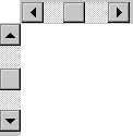
MGCEBarsNPops provides access to the standard Windows CE scrollbars, both horizontal and vertical. The size of the control determines the type of control displayed by an application. If the control is wider than it is tall, a horizontal scrollbar is displayed and if taller than it is wide, a vertical scrollbar is created. This may be changed at runtime but there is a practical ratio if you change the orientation. If this ratio is exceeded, the object will appear as a "blob" on the window without displaying the scrollbar components. The scrollbar controls support the following properties, methods and events:
AddObject "MGCEBarsNPops.Scrollbar", "Name", x, y, xsize, ysize
| Enabled | Set Enable to TRUE (non-zero) to enable a scrollbar or FALSE (zero) to disable a scrollbar. The scrollbars are enabled by default.
|
| Orientation | The orientation of a scrollbar is initially determined by the size of a scrollbar when it is created. If a scrollbar is wider than it is tall, a horizontal scrollbar is created and if taller than it is wide, a vertical scrollbar is created. You may change this default orientation using this property although there is a practical ratio. When this ratio is exceeded, the object will appear as a "blob" without the actual scrollbar. Setting this property to one forces a vertical scrollbar, setting the property to zero forces a horizontal scrollbar.
|
| Min | determines the minimum value used by the scrollbar. The default value for Min is zero.
|
| Max | Max determines the maximum value used by the scrollbar. The default value for Max is 100.
|
| PageSize | There are three ways to change a scrollbar's position. Tapping the arrows at either of the scrollbar changes the position value by one. Sliding the thumb changes the value by a random amount which is tracked by the scrollbar. Tapping the area between the arrows changes the position by an amount determined by the PageSize setting. The default value for PageSize is ten.
|
| Style | Set and retrieve the Style property which determines how the edge of the control is displayed. This is different from the Border property. Styles include:
|
| Tabstop | When set to TRUE (non-zero), the scrollbar is accessable via the tab key. FALSE removes the scrollbar from the tab order.
|
| Version | Return the current version of this control as an integer |
| Value | Value determines the current position of the scrollbar within the range set by Min and Max. The default value for Value is zero. Changing the value of Value changes the scrollbar thumb.
|
| Show | Call this method to make a scrollbar visible.
|
| Hide | Call the Hide method to hide a scrollbar.
|
| SetFocus | Call the SetFocus method to set input focus to a scrollbar.
|
| Change(Value) | When any part of the scrollbar is tapped upon, a new value is calculated internally and sent to the application as a Change event. The new value is not actually applied to the scrollbar by default and it is up to you to update the scrollbar with the new value or not, depending on your application.
|
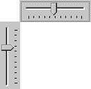
MGCEBarsNPops provides access to the Trackbar common control, both horizontal and vertical, the type determined by the size of the control when created. If a trackbar is wider than it is tall, a horizontal control is created and if taller than it is wide, a vertical control is created. The trackbar controls support the following properties, methods and events:
AddObject "MGCEBarsNPops.Trackbar", "Name", x, y, xsize, ysize
| Min | Min determines the minimum value used by the trackbar. The default value for Min is zero.
|
| Max | determines the maximum value used by the trackbar. The default value for Max is 100.
|
| Value | Value determines the current position of the trackbar within the range set by Min and Max. The default value for Value is zero. Changing the value of Value changes the trackbar pointer.
|
| LineSize | The trackbar Pos value may be changed using the up/down arrows and PageUp/PageDown keys. LineSize determines how much to change the value when the arrow keys are used. The default value for LineSize is one.
|
| PageSize | PageSize determines how much to change the value when PageUp/PageDown is pressed on the keyboard. The default value for PageSize is ten.
|
| TickFreq | "Ticks" are small "dots" displayed by a trackbar and are used along with the pointer to determine the current value of the trackbar. The default value of TickFreq is ten, displaying a dot every 10 units.
|
| Ticks | Ticks may be enabled by setting this property to TRUE (non-zero) and removed by setting it to FALSE (zero). Ticks are enabled by default.
|
| Orientation | The type of trackbar created is determined by the size of the trackbar. If the trackbar is wider than it is tall, a horizontal trackbar is displayed and if taller than it is wide, a vertical trackbar is displayed. You may change this by setting the Orientation property at run-time. TRUE (non-zero) forces a vertical trackbar and FALSE (zero) forces a horizontal trackbar.
|
| Enabled | Set this property to TRUE (non-zero) to enable a trackbar or FALSE (zero) to disable a trackbar. By default, trackbars are enabled when created.
|
| Style | Set and retrieve the Style property which determines how the edge of the control is displayed. This is different from the Border property. Styles include:
|
| Version | Return the current version of this control as an integer |
| Show | Call this method to make a trackbar visible.
|
| Hide | Call the Hide method to hide a trackbar.
|
| SetFocus | Call the SetFocus method to set input focus to a trackbar.
|
| Change(value) | When any part of the trackbar is tapped upon, a new value is calculated internally and sent to the application as a Change event. Unlike scrollbars, the trackbar display is updated internally and you do not have to set the new value.
|
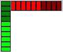
MGCEBarsNPops provides a horizontal and vertical segmented "meter", similar to the Progress Bar. Unlike the progress bar, both orientations are supported, all segments fit within the bounds of the control and two colors are used in the control display, one for the area less than the current value and one for the area more than the current value. The type of meter created is determined by the size of the control when created. If wider than it is tall, a horizontal meter is created and if taller than it is wide, a vertical meter is created. The VU Meter control supports the following properties, methods and events:
AddObject "MGCEBarsNPops.VUMeter", "Name", x, y, xsize, ysize
| Min | Minimum value of the meter control. The default value of Min is zero.
|
| Max | Maximum value of the meter control. The default value of Max is 100.
|
| Value | Current value of the meter control. The default of Value is zero.
|
| LowColor | The area between Min and Value are displayed using the LowColor RGB value. The LowColor default value is 0 (black).
|
| HighColor | The area between Value and Max are displayed using the HighColor RGB value. The HighColor default value is 8421504 (dark gray).
|
| Segments | The control is divided in a number of segments, appearing as an "LED VU Meter". The number of segments are determined by the Segments property and the default for Segments is ten.
|
| Orientation | The type of control created depends on the size of the control. If it is wider than it is tall, a horizontal control is created and if taller than it is wide, a vertical control is created. You may change this by forcing the control to horizontal by setting Orientation to FALSE (zero) or to vertical by setting it to TRUE (non-zero).
|
| Version | Return the current version of this control as an integer |
| Show | The Show method displays the control.
|
| Hide | The Hide method hides the control.
|
MGCEBarsNPops provides access to the standard Windows CE Progress control. Windows CE only supports horizontal progress bars. MGCEBarsNPops supports the following properties, methods and events:
AddObject "MGCEBarsNPops.Progress", "Name", 0, 0, 0, 0
| Min | Minimum value of the progress bar. The default value is zero.
|
| Max | Maximum value of the progress bar. The default value is 100.
|
| Value | Current position of the progress bar. Value must be within the range set by Min and Max and the default value is zero.
|
| Smooth | By default, the progress bar has a segmented display. You may select between a segmented and smooth (non-segmented) display by setting the Smooth property. TRUE (non-zero) sets the control to a smooth display and FALSE (zero) sets the control to a segmented display.
|
| Step | The progress bar value may be changed either directly via the Value property or internally using the DoStep method. When using the DoStep method, the amount of change is determined by the value of Step. The default value of Step is ten.
|
| Border | Set Border to TRUE (non-zero) to display a border around the control or FALSE (zero) to eliminate the border.
|
| Style | Set and retrieve the Style property which determines how the edge of the control is displayed. This is different from the Border property. Styles include:
|
| Version | Return the current version of this control as an integer |
| DoStep | Call DoStep to increase the value of the Value property by the amount specified by the Step property.
|
| Show | The Show method causes the control to display.
|
| Hide | The Hide method causes the control to disappear.
|
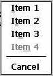
MGCEBarsNPops provides a popup menu to applications. Unlike the standard menu of an application, a popup menu is normally not displayed and may be displayed anywhere on the screen at any time under program control. The popup menu control supports the following properties, methods and events:
addobject "MGCEBarsNPops.PopupMenu", "Name", 0, 0, 0, 0
| Checked | You may check, uncheck and retrieve checked status of a menu item using this property. When set to TRUE (non-zero), a menu item is checked and FALSE removes the checkbox, if any. A menu item must be specified and starts at one (1).
|
| Enabled | The Enabled property sets and retrieves the enabled state of a given menu item. TRUE (non-zero) enables a menu item while FALSE (zero) disables the item. Menu items start with item one (1).
|
| Version | Return the current version of this control as an integer |
| Add | The Add method adds an item to the popup menu. The new item is added to the bottom (end) of the menu. If a string begins with a dash (-), a separator bar is added to the menu. |
| Remove | The Remove method removes an item from a popup menu, one (1) being the first item in a menu.
|
| RemoveAll | Remove all items from a menu using this method.
|
| Show | The Show method displays a popup menu of a specified type and at a specified location on the screen. Flags used with Show are:
You may use any combination of the Left/Center/Right and Top/VCenter/Bottom flags. The menu automatically disappears when something on the screen is tapped, whether on or off the menu itself.
|
| Click(menutext) | The calling program will receive a Click event from the Popup Menu control when a menu item is tapped by the user and provides the text of the selected item. If something else onscreen is tapped while the menu is displayed, the menu is dismissed without firing this event.
|
The StatusBar Control provides access to the Windows CE StatusBar as commonly found at the bottom of application windows.
AddObject "MGCEBarsNPopos.StatusBar", "Name", x, y, xsize, ysize
| Sections | A status bar may contain more than one section, each having its own size and text. The Sections property sets and retrieves an array of values used to determine the width of each section.
|
| Caption | Each section of a status bar contains a caption. The Caption property sets and retrieves that caption from a specific section.
|
| Version | Return the current version of this control as an integer |
10/23/99: Added StatusBar object